


The Contrast and Intensity in Whiplash
What’s the topic of Whiplash?
Whiplash is Damien Chazelle’s second movie. Released in 2014, it follows Andrew Newman, a young prodigy whose passion is playing the drums. He is however, quickly faced with the excellence required in this school, embodied by the best teacher at hand: Terence Fletcher. The latter heard Andrew play and “threatened” him to join his jazz band (or the one he teaches at least). Knowing how famous Terence is and how praised he is in the field, Andrew did not hesitate one bit – but at what cost?
Whiplash as a potent thematic device
The use of black contrasts in the movie is one that cannot be ignored. Damien Chazelle uses a dark palette, creating deep shadows that highlight the intense, suffocating, and above all toxic environment of the music conservatory. Andrew, however, often shifts from lighter colors that either represent his innocence or life outside music, to darker colors that reflect his fall into obsession and depravity. Even though the general atmosphere is rather obscure, some splashes of yellow, gold and orange in the set design and lighting can be interpreted as representing ambition and energy.
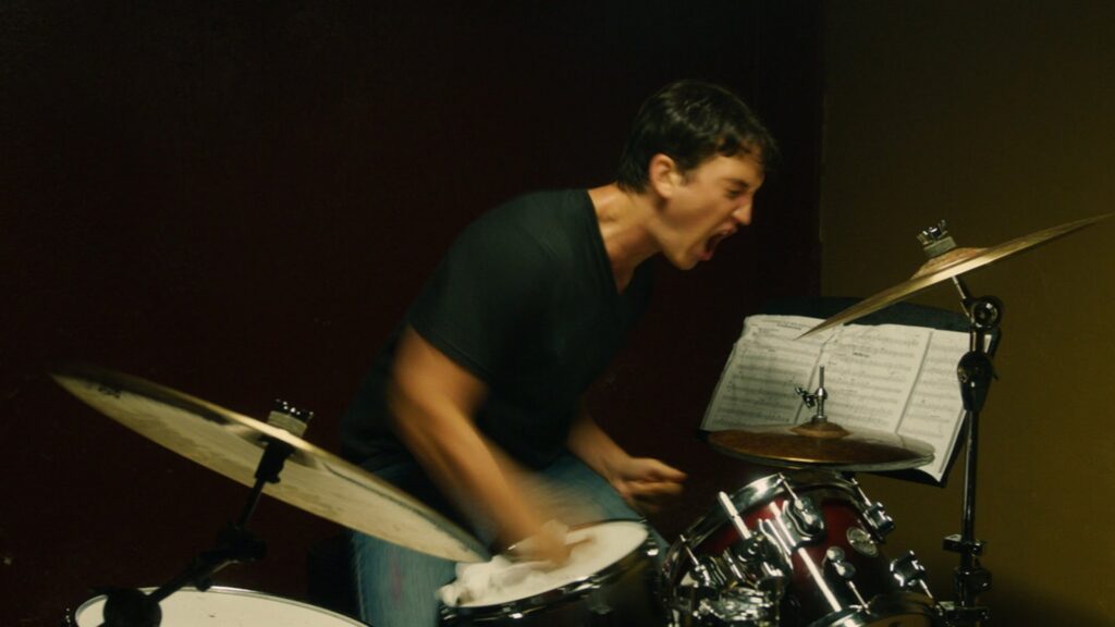

https://les-chroniques-de-francisco.blog4ever.com/whiplash-that-s-my-tempo https://www.netflix.com/title/70299275
While Andrew Neiman chased a single, isolated peak of perfection through a crucible of fire and ice, Damien Chazelle pivots in La La Land to examine ambition’s effect on connection.
The Saturated Emotions in La La Land
What is La La Land?
Damien Chazelle released LaLaLand in 2016, which makes it the third movie he directed. The story mainly takes place in Los Angeles, California. Mia, a young woman who dreams of becoming an actress, keeps working at a coffee shop while auditioning for as many movies as she can. Sebastian too has a dream: opening his own Jazz Club. Unfortunately, he, like Mia, has to accumulate small jobs in order not only to survive but also try and make his dream come true. Both of them have a passion, and it is their respective ones that are going to make them cross paths.
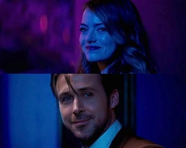
https://medium.com/@katrinaiguban/a-knowing-smile-to-my-past-8793ad77ae5c
What’s so special about the colorimetry then?
In many of the movie’s shots, our eye is caught by the different colors and their use throughout the main scenes. The colors Blue, Red and Yellow, often worn by Mia and Sebastian, are omnipresent. They represent them in their purest, most individualistic state, full of uncompromised dreams. The three other main colors: Purple, Green and Orange, appear when their lives and dreams blend through their relationship, highlighting passion, compromise and the crossing of their paths. Color in this musical is used to map the relationship’s progress and eventual separation with a vibrant palette, often switching to more realistic colors as the relationship faces a harsh reality of ups and downs. In a nutshell, the technicolor-like palette used links the character’s ambitions to the city’s glorious past.
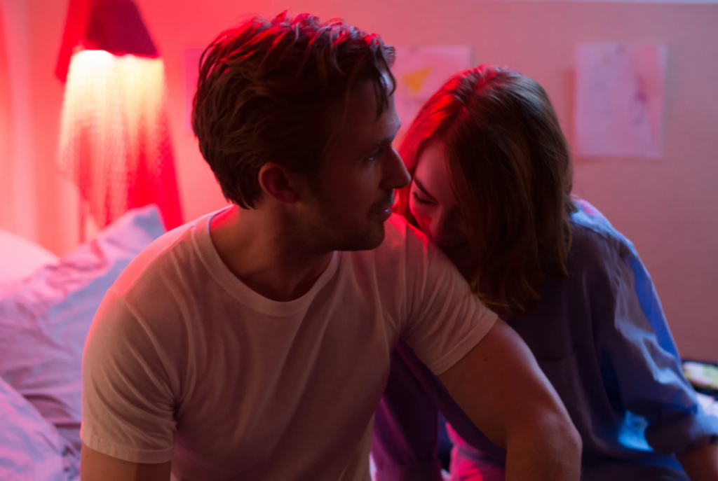
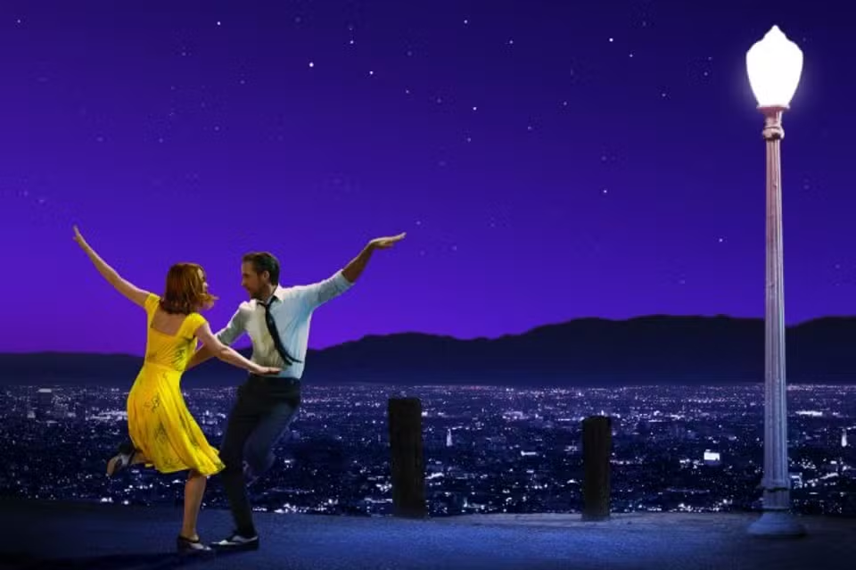
https://www.vox.com/culture/2016/12/13/13918728/la-la-land-screenplay-emotional-spectacle https://www.lemonde.fr/idees/article/2017/02/25/la-la-land-eloge-de-la moyennitude_5085453_3232.html
The quiet, bittersweet sacrifice at the heart of La La Land’s color story sets the stage for Chazelle’s grandest, and most cynical, exploration yet. With Babylon, he explodes the intimate pain of the individual struggle onto the vast, debaucherous canvas of Hollywood’s transition from silent film to sound.
The Diverse Approaches in Babylon
The Beginnings of Sound Cinema
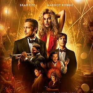
Babylon takes place in Hollywood during the late 1920s and early 1930s, during the tumultuous shift from silent films to “talkies.” The story is that of an excessive and sometimes brutal rise and fall of ambitious characters caught in this period of change. The main characters: Jack Conrad, Nellie LaRoy, and Manny Torres represent the contrasts between the decadent freedom of early cinema and the conservative environment that sound films impose.
https://www.allocine.fr/film/fichefilm_gen_cfilm=275675.html
A Purposely Imperfect Image and Color Palette
The film uses intense color divides to highlight the tension between the fantasy of Hollywood and the harsh reality of its making. The interiors enhance rich and saturated jeweled tones in order to represent the decadence and fantasy of early Hollywood. This choice emphasizes the hot, hostile, and raw Californian environment, depicting it as the “desert” where this artificial life was born.
Photo Credit: https://collider.com/damien-chazelle-movies-ranked/
Other posts that may interest you:
- Le “Conejo Malo” contre l’archipel : comment Bad Bunny a rendu son île si attrayante
- Travel to the Beat of Your Favorite Artists
Discover more from The Sundial Press
Subscribe to get the latest posts sent to your email.